When a worker tests positive for infectious diseases, like COVID-19, the GoAware Organization Administrator must analyze the contact trace data to identify individuals who came in close proximity to the infected worker.
Watch the how-to here:
Once you have downloaded the contact trace data from the GoAware Portal, it is now time to
analyze the data according to your organization’s policy. The file includes information on close
contact interactions based on two-minute increments, allowing the organization to identify the
closeness of interaction over time. The following steps are best practices for analyzing the
data, please ensure you follow your organization’s policy when performing a contact trace.
- Open the data file in Microsoft Excel and learn what each column means.
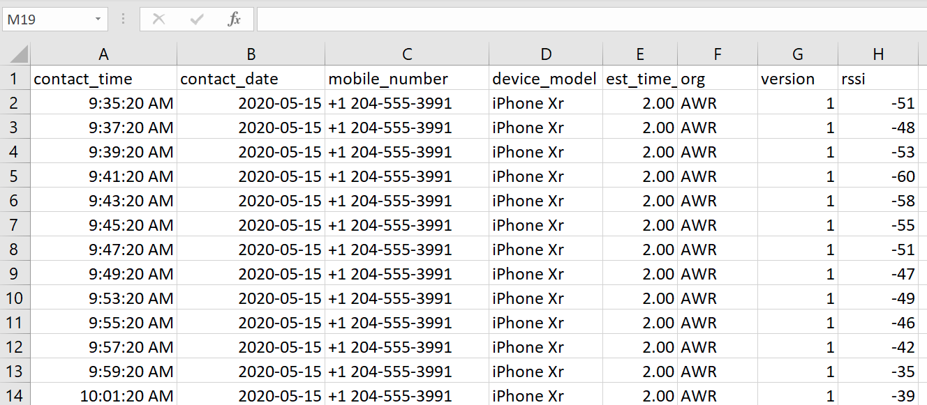 Data Export Column Key:
A) Contact Time = The time of day the contact was registered as a close interaction.
B) Contact Date = The date of the close interaction.
C) Mobile Number = The phone number of the individual that was in close contact.
D) Device Model = The phone model of the individual that was in close contact.
E) Est Time = Estimated time of the interaction. Note, these are in two-minute intervals, 2.00 could be anywhere from a few seconds to two full minutes.
F) Org = The organization the individual is associated to.
G) Version = The GoAware App version of the contact.
H) RSSI = The Received Signal Stength Indicator. This value indicates the closeness of the contact interaction - the threshold values for this vary between iOS devices and Android devices. Please refer to the table below to understand what the value means in relation to the device.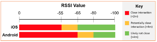
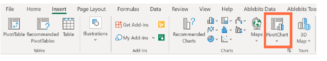
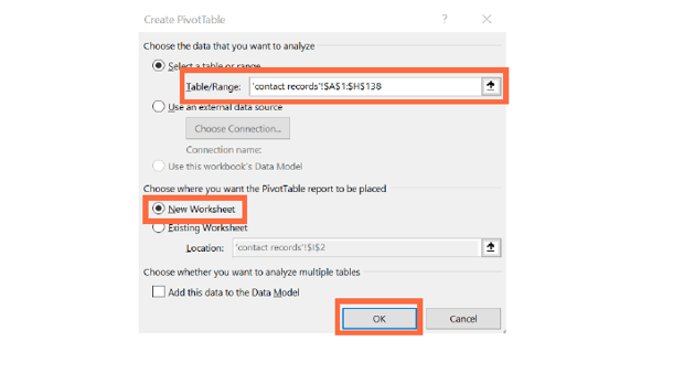
*Note: These are rough guidelines, not hard rules, and the Administrator is expected to exercise judgement in determining whether contacts should be considered significant. - It is recommended that you create a pivot table to analyze the data effectively. To do this, select "Insert" and then press "PivotChart".
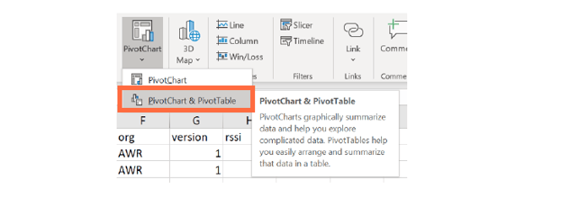
- Then select "PivotChart & PivotTable".
- The tool should automatically detect the table range, if it does not, please highlight the records. Once your desired records are listed in the Table/Range section, select "New Worksheet" and the "Ok".
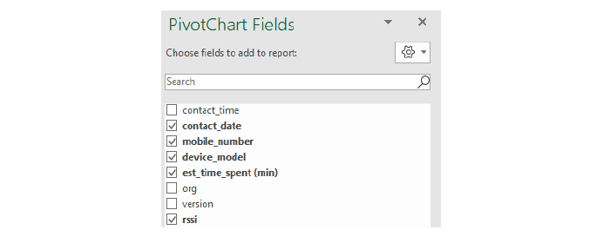
- Next, you will choose the fields for your report. We recommend choosing contact date, mobile number, device model, estimated time spent, and RSSI.
- Select the filters for your report. Drag and drop the contact date and device model axis
into the filters box, leaving the mobile number in the axis (categories). Then, move the
sum of RSSI from the values box to the filters box, leaving the sum of est time spent.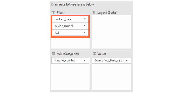
- Now, on the left-hand side you will have a chart with all your data in an easily filterable
format.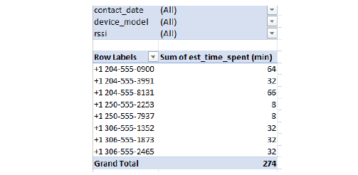
- Next, select all iPhone models from the device model filter. iPhones have a different
RSSI threshold than Android devices for close contact (0 to 55 is <2m; 55 to 65 is <4m;
65 to 100 is >4m).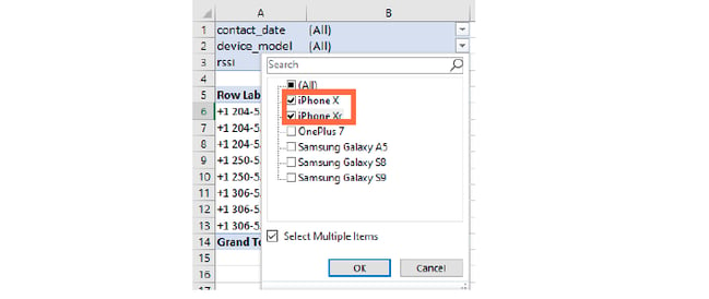
- After iPhones are selected, filter the RSSI value to only include values between 55 and 0.
Values between 0 and 55 for iPhones would indicate a close interaction of less than 2m.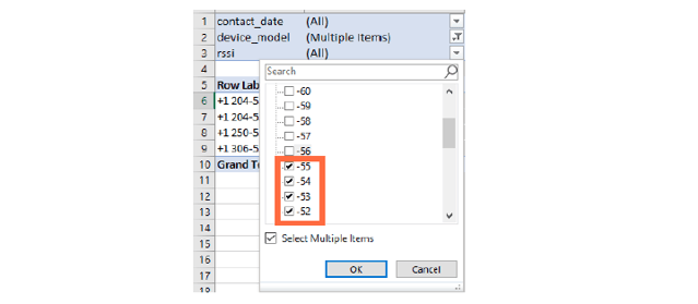
- Now, you will see which contacts were in close contact and how long they were in contact.
For example, in the table below the first and the last contacts exceeded 15 minutes of close
contact and should therefore be contacted. The threshold of time spent and the actions to
take should be indicated in your workplace policy. 15 minutes or longer is based on CDC
guidelines.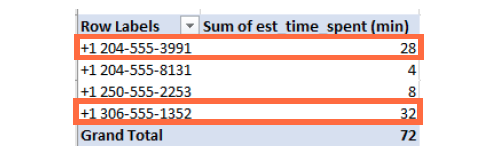
- To view all Android devices that were in close contact, deselect all iPhone models from the
device model filter leaving the rest of the device selected.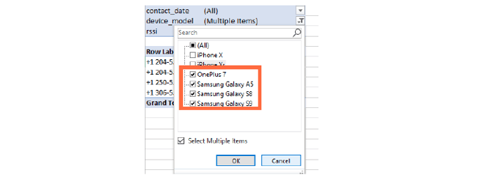
- Android thresholds for close contact are as follows: 0 to 65 is <2m; 65 to 80 is <4m; 80
to 100 is >4m. Deselect all RSSI values below 65 to show only close Android contacts.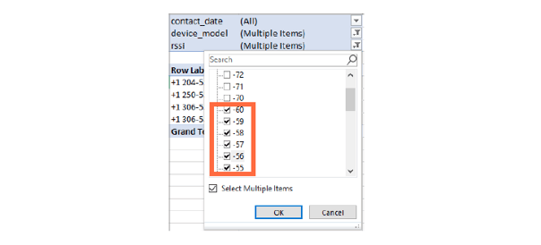
- Now, you will see which Android contacts were in close contact and how long they were in
contact. For example, only the first, third and fourth contact exceeded 15 minutes of close
contact and should therefore be contacted as a part of your contact trace. The
threshold of time spent and the actions to take should be indicated in your workplace policy.
15 minutes or longer is based on CDC guidelines.
- To see the details of any contact and their interactions, simply double click the sum of the
estimated time in your list and you will be brought to a chart like the one below. This is
helpful to show if the contact interactions were over many days or on one day to help you
determine the contact’s risk.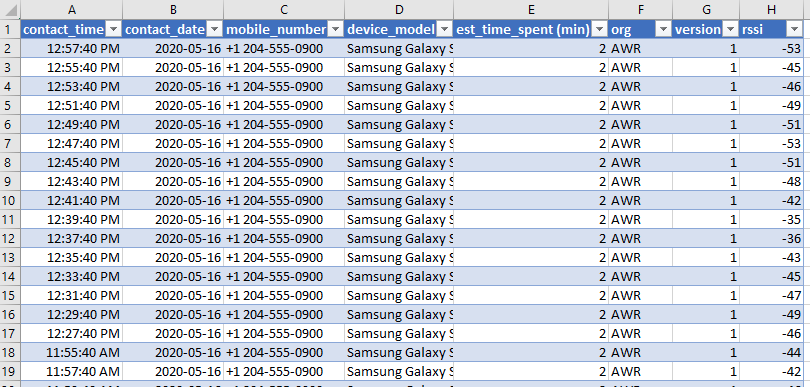
- Now you have a list of contacts that had close contact with the infected individual for a
period of time determined by your organization’s policies. From here, you should
immediately reach out to the individuals, starting with the longest contact duration. Please
inform the individuals of the next steps based on your workplace safety policies.
Need more help? Contact us:
- support@aware360.com
- +1 877 352 8522